Quick Start#
[1]:
import os
from numba.core.errors import NumbaDeprecationWarning, NumbaPendingDeprecationWarning, NumbaWarning
import warnings
warnings.simplefilter('ignore', category=NumbaWarning)
warnings.simplefilter('ignore', category=NumbaDeprecationWarning)
warnings.simplefilter('ignore', category=NumbaPendingDeprecationWarning)

import numpy as np
import pandas as pd
import scanpy as sc
import anndata as ad

import muon as mu
# Import a module with ATAC-seq-related functions
from muon import atac as ac

from matplotlib import pyplot as plt
import seaborn as sns

sc.set_figure_params(
    scanpy=True, dpi_save=600, vector_friendly=True, format="pdf",
    facecolor=(1.0, 1.0, 1.0, 0.0), transparent=False
)

from matplotlib import rcParams
rcParams["savefig.bbox"] = "tight"
rcParams["savefig.dpi"] = 600
/home/chaozhong/miniconda3/lib/python3.10/site-packages/tqdm/auto.py:21: TqdmWarning: IProgress not found. Please update jupyter and ipywidgets. See https://ipywidgets.readthedocs.io/en/stable/user_install.html
  from .autonotebook import tqdm as notebook_tqdm
Introduction#
In the quick start tutorial, we will use a down-sampled 10X Multiome HSPC dataset to demonstrate the analysis pipeline and all utilities in the TREASMO toolkit.
Data Availability#
Data can be downloaded from the Google Drive
Load in the 4 modules of TREASMO#
[2]:
import treasmo.tl
import treasmo.core
import treasmo.ds
import treasmo.pl
/home/chaozhong/miniconda3/lib/python3.10/site-packages/libpysal/weights/util.py:23: UserWarning: geopandas not available. Some functionality will be disabled.
  warn("geopandas not available. Some functionality will be disabled.")
Data Preparation#
1. Input#
[4]:
mudata = mu.read('data/HSPC_toyexample.h5mu')
#mudata
2. Calculate feature sparsity per group#
group_by is a dict[5]:
mudata = treasmo.tl.feature_sparsity(mudata, group_by={'rna':'annotation',
                                                       'atac':'annotation'})
3. Prepare gene-peak pairs Data Frame#
[6]:
genes = mudata.mod['rna'].var_names
peaks = mudata.mod['atac'].var_names
upstream, downstream = 50000, 0
ref_gtf_fn = '../replication/data/Homo_sapiens.GRCh38.104.GeneLoc.Tab.txt'
[7]:
pairsDF = treasmo.tl.peaks_within_distance(genes, peaks, # genes and peaks names to include
                                           upstream, downstream, # define the genome range, upstream of TSS and downstream of TTS
                                           ref_gtf_fn, # reference GTF file path
                                           # see example at https://github.com/ChaozhongLiu/TREASMO/tree/main/replication/data/Homo_sapiens.GRCh38.104.GeneLoc.Tab.txt
                                           no_intersect=True, # if peak within the range lies in another gene body, remove the peak or not
                                           id_col='gene_id', # gene ID column name in GTF file
                                           split_symbol=[':','-']) # delimiter connecting chromosom and position in ATAC-seq peak ID
Remove nearby peaks if it lies on the gene body or promoter regions of other genes.
[8]:
print("Number of pairs: ",pairsDF.shape[0])
print("Number of genes: ",len(pairsDF['Gene'].unique()))
print("Number of peaks: ",len(pairsDF['Peak'].unique()))
Number of pairs:  1319
Number of genes:  81
Number of peaks:  1314
Core function - Quantifying single-cell gene-peak correlation strength#
[9]:
pairsDF = treasmo.core.Global_L(mudata, pairsDF, # Input MuData and gene-peak pairs Data Frame
                                mods=['rna','atac'], # mod names in MuData
                                permutations=0, # This is the permutation-based significant test, set 0 if not needed
                                seed=1, # random seed to make the results replicable
                                max_RAM=72) # maximum memory usage
Calculating KNN graph-based global correlation...
/home/chaozhong/.local/lib/python3.10/site-packages/treasmo/lee_vec.py:62: RuntimeWarning: invalid value encountered in matmul
  self.ctc = self.connectivity.T @ self.connectivity
Finished calculating correlation. 0.529s past
[10]:
mudata = treasmo.core.Local_L(mudata, # Input MuData
                              genes=pairsDF['Gene'].tolist(), # Input gene list
                              peaks=pairsDF['Peak'].tolist(), # Input peak list
                              mods=['rna','atac'], # mod names in MuData
                              rm_dropout=False, # if True, zero the strength index when derived from features with dropout values
                              seed=1, max_RAM=72)
Inferring KNN graph-based local correlation...
Following changes made to the AnnData object:
        KNN graph-based local correlation results saved in uns['Local_L']
        Gene-peak pair names saved in uns['Local_L_names']
Finished Inferring local correlation. 0.244s past
[ ]:
Downstream Analysis#
1. Find regulatory markers among groups#
TREASMO provides several functions to perform statistical test that compares the gene-peak correlation among groups. - ds.FindAllMarkers: one vs rest test, find markers in each cluster and return the result - ds.FindMarkers: one vs one test, compare user provided two groups - ds.FindPathMarkers: one vs one test, compare all pairs of groups with user provided clisters. (Usually along a trajectory path)
[11]:
MarkerDf = treasmo.ds.FindAllMarkers(mudata, ident='annotation',
                                     mods=['rna','atac'],
                                     corrct_method='bonferroni', seed=1)
Performing statistical test for correlation differences among identities...
Completed! 9.29s past.
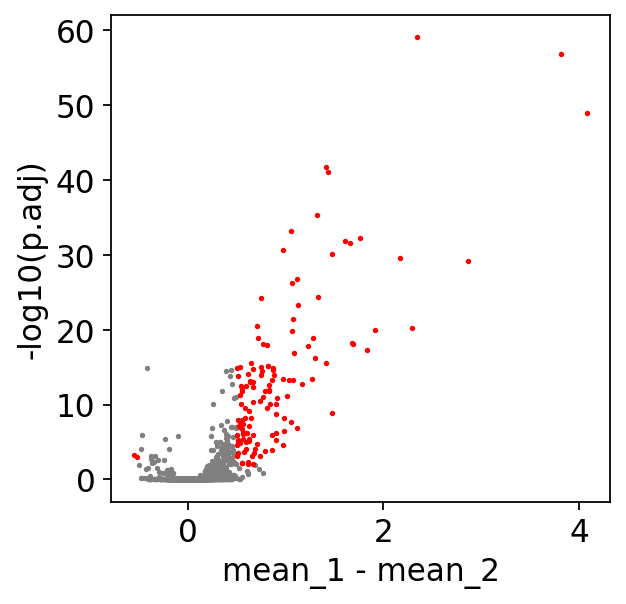
Next, ds.MarkerFilter filters the results based on user defined cutoffs, returns the filtered results, and plot the volcano plot.
[12]:
MarkerDf_filt = treasmo.ds.MarkerFilter(MarkerDf,
                                        mean_diff=0.5, # minimum mean difference between two groups
                                        min_pct_rna=0.1, # percentage of cells that express the gene as sparsity cutoff
                                        min_pct_atac=0.05, # percentage of cells that have the peak as sparsity cutoff
                                        p_cutoff=1e-2, # p-value cutoff
                                        plot=True) # plot volcano or not
[13]:
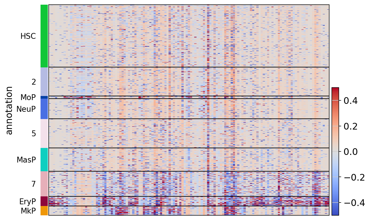
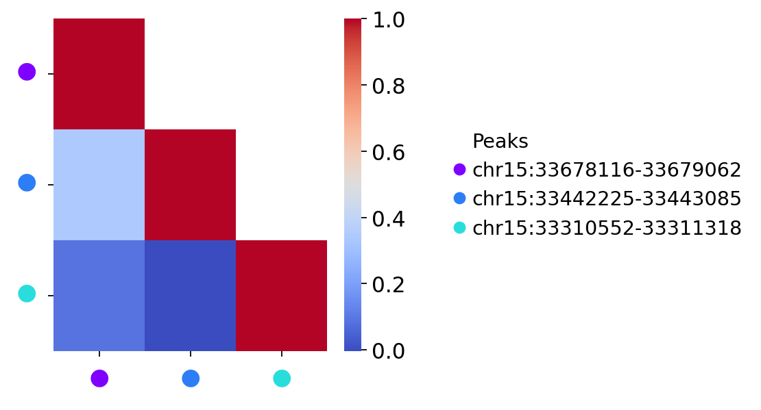
treasmo.pl.LocalCor_Heatmap(mudata,
                            pairs=np.unique(MarkerDf_filt['name']), # which pairs to plot
                            cluster=True, # cluster pairs or not
                            groupby='annotation', # group cells by the ident
                            cmap='coolwarm', # color pallette
                            vmin=-0.5, vmax=0.5) # color value range
                            # you can alos pass any other parameters to sc.pl.heatmap()
WARNING: Gene labels are not shown when more than 50 genes are visualized. To show gene labels set `show_gene_labels=True`
/home/chaozhong/miniconda3/lib/python3.10/site-packages/sklearn/cluster/_agglomerative.py:1005: FutureWarning: Attribute `affinity` was deprecated in version 1.2 and will be removed in 1.4. Use `metric` instead
  warnings.warn(
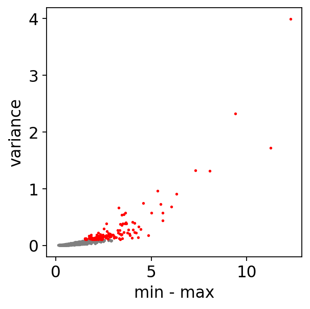
2. Detect trajectory dynamics along user defined path#
[14]:
dynamicDf = treasmo.ds.FindPathDynamics(mudata,
                                        ident='annotation', # ident column name to define path
                                        path=['HSC','5','7','EryP'], # list of clusters ordered by their sequence on the trajectory. A path here should have no branch
                                        range_cutoff=0.5, # filtering cutoff, max - min of correlation strength
                                        var_cutoff=0.1, # correlation strength variance cutoff
                                        pseudotime='dpt_pseudotime', # trajectory pseudotime label name in MuData.obs
                                        plot=True) # plot volcano or not
Empty bins removed. 92 bins left
[15]:
gene = 'ENSG00000198838'
dynamicDf['Gene'] = dynamicDf.index.str.split('~').str[0]
dynamicDf['Peak'] = dynamicDf.index.str.split('~').str[1]
peaks = dynamicDf.loc[dynamicDf['Gene']==gene]['Peak'].tolist()
ds.PathDynamics generates the time-bin correlation strength data and save it in MuData.uns[‘pathDym’][PATH_NAME][GENE]
[16]:
mudata = treasmo.ds.PathDynamics(mudata,
                                 gene=gene, # a single gene name
                                 peaks=peaks, # peaks in the selected pairs
                                 ident='annotation',
                                 path=['HSC','5','7','EryP'], # PATH_NAME will be HSC-5-7-EryP in this example
                                 pseudotime='dpt_pseudotime',
                                 bins=100) # how many time bins to split the data into along the trajectory
Empty bins removed. 92 bins left
[17]:
treasmo.pl.PathDynamics(mudata,
                        gene=gene,
                        #xlim=(0,0.52), # xlim and ylim to set the x and y range in plot
                        ylim=(-1.0,2),
                        ident='annotation',
                        path=['HSC','5','7','EryP'])
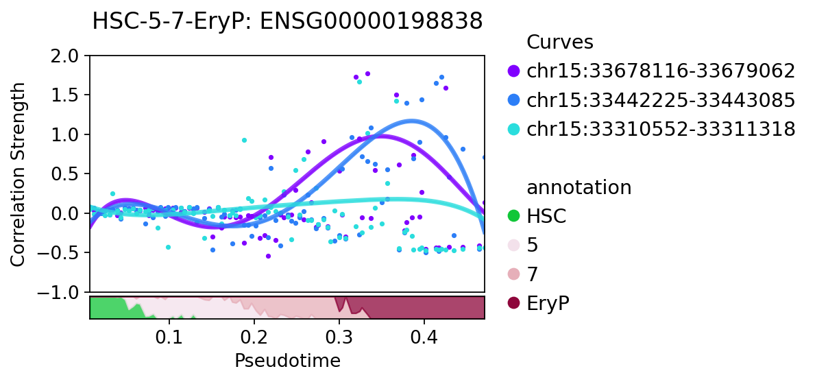
pl.visualize_marker can visualize a specific marker correlation strength together with gene expression and chromatin accessibility.
[18]:
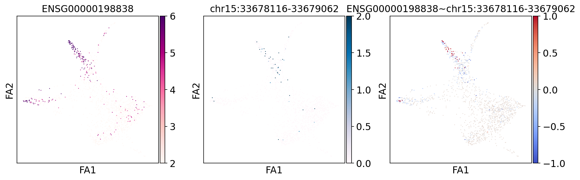
treasmo.pl.visualize_marker(mudata,
                            gene=gene, # gene name
                            peak=peaks[0], # peak name, gene-peak pair must appear in uns['Local_L_names']
                            mods=['rna','atac'],
                            basis='draw_graph_fa', # on which basis/embedding to plot cells
                            cmaps=['RdPu','PuBu','coolwarm'], # colors for each of the 3 plots
                            vmins=[2,0,-1], vmaxs=[6,2,1], # value ranges for each of the 3 plots
                            size=5, # dot size
                            figsize=(14,4)) # figure size
ENSG00000198838 and chr15:33678116-33679062
[19]:
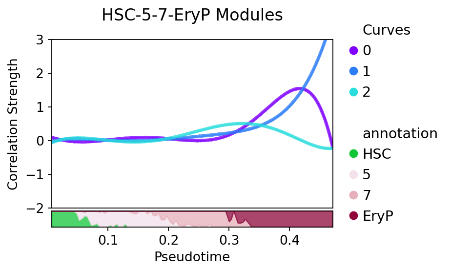
treasmo.pl.DynamicSumMtx(mudata,
                        gene=gene,
                        ident='annotation',
                        path=['HSC','5','7','EryP'],
                        cmap='coolwarm')
3. Discover regulatory modules along trajectory path#
[20]:
prpDf = treasmo.ds.TimeBinProportion(mudata, ident='annotation',
                                path=['HSC','5','7','EryP'],
                                pseudotime=['dpt_pseudotime'],
                                bins=100)
Empty bins removed. 92 bins left
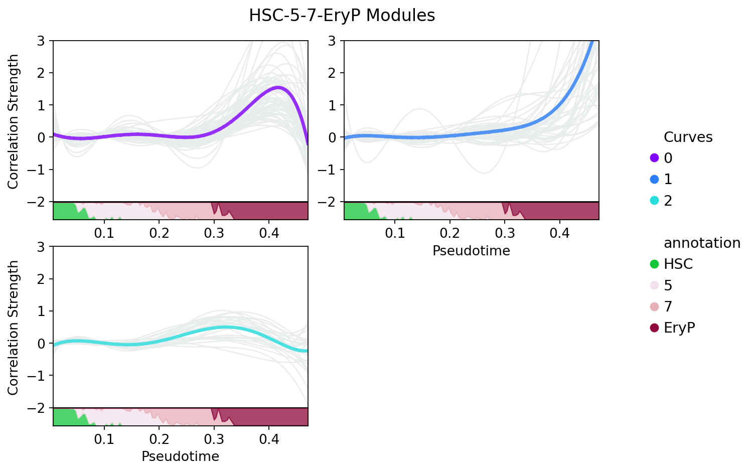
Next, we run ds.DynamicModule to discover regulatory modules. TREASMO uses self-organizing map (SOM) to do so. It first fits the time-bin data with Gaussian Process based regression, then clusters all curves on the fitted data.
[21]:
somDict = treasmo.ds.DynamicModule(mudata, ident='annotation',
                                   path=['HSC','5','7','EryP'],
                                   pseudotime=['dpt_pseudotime'],
                                   bins = 100, # How many bins to divide the data along trajectory
                                   fitted = 100, # How many time points to generate the fitted data
                                   features = dynamicDf.index.to_numpy(), # features to include. The function calculates time-bin data, and no previous step is needed.
                                   num_iteration=5000, # number of iterations to optimize the SOM
                                   som_shape=(1,3), # shape of the SOM. (2,2) means we want 4 clusters, the structure is 2x2
                                   sigma=0.35, # the radius of the different neighbors in the SOM
                                   learning_rate=.1, # optimization speed
                                   random_seed=1)
Empty bins removed. 92 bins left
Start training...
 [ 5000 / 5000 ] 100% - 0:00:00 left
 quantization error: 4.151610804905542
split=False[22]:
path = ['HSC','5','7','EryP']
treasmo.pl.DynamicModule(mudata,
                         somDict, # ds.DynamicModule results
                         prpDf, # ds.TimeBinProportion results
                         split=False, # split by modules or not
                         #xlim=(0,0.52),
                         ylim=(-2.0,3.0))
Or, you can split each module by setting split=True. This time, all the curves in the modules will be plotted in grey.
[23]:
treasmo.pl.DynamicModule(mudata, somDict, prpDf,
                                  split=True,
                                  n_cols=2,
                                  #xlim=(0,0.52),
                                  ylim=(-2.0,3.0))
[ ]: